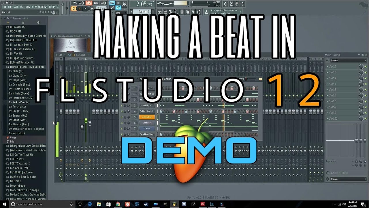
The ability to apply swing per channel rather than just globally is a welcome improvement, as is the big '+' button at the bottom of the Channel Rack, which brings up the Insert menu for the quick addition of channels. Notes programmed into the Step Sequencer are automatically updated in the Piano Roll of that channel, allowing for deeper editing in the latter without having to copy and paste patterns from one to the other. The Channel Rack is simply the new name for the previously untitled window housing the overview of Instruments, Samplers and Internal Generator channels used in a project, which can now be manually switched between Piano Roll preview and Step Sequencer views, depending on the preferences of the user. Multitouch display users will also be overjoyed to learn that FL's mixer now fully supports that technology. New visual options include a range of mixer layouts (Compact, Wide, Extra Large, etc), control over which elements are shown in the mixer, virtual cables showing routings between channels, and the ability to resize many things that previously couldn't be, like the mixer and Channel Rack. It's still based on that familiar grey colour palette, but the modern, vivid revamp works wonders, bringing FL firmly into line with the competition, aesthetically.

The look has been completely redesigned, too - gone are the days when a long FL session could feel like a stay in a Soviet car park.


 0 kommentar(er)
